Thursday, October 11, 2012

Barron Biros Ad for his Jean Typeface

Look at the text that Barron wrote and how he introduces the new typeface along with the imagery of where his concept came from...his own jeans.

www.friendsoftype.com

How to.....


A artist friend of mine sent this to me years ago. Some things never change.

In Plain Sight


www.ffffound.com/

Starting the RE-design packaging project


Each of you are currently working on redesigning a wine/olive oil or sake product as a specialty item. This upscale design must incorporate a wide range of concepts and materials in order to make it successful.
Try new materials.
Experiment with type and image.
Understand your own concepts and approach.
RE-packaging can take many forms. Think about it.
Distance yourself from the others in your class by being more innovative with not only the concept but the production of the RE-design. 

The logo and the new bottle/container design and it's packaging.
You have several weeks to get this project completed which is ample time.
Spend that time looking at what has come before you in terms of design.
It's a time to get out of your safety and comfort zone and do something spectacular.

Learning is never static.
"Good is the Greatest enemy of Great."
Good is mediocre.

Corny Town came to stay in Atlanta


What a waste of manpower and design.

Typography Tables


www.fakturadesign.com/index.php?main_page=product_info&cPath=2&products_id=19

How lucky you are to have this site for all it's beauty.
www.thedielinewine.com

Found Type: When Documents become Art

Found Library Card 1997


Photo Store receipt 1998


Warhol Paris Review Receipt 1969
In 1964 The Paris Review initiated a series of limited edition prints and posters by major contemporary artists to encourage works in the print medium while publicizing The Paris Review. Below is Andy Warhol's submission. Untitled. 1965. Silkscreen. 37" x 27". Edition of 150

Illustrative Ads using your Illustrative Alphabet


www.houseindustries.com

Once you have your Illustrative Alphabet finished you should begin thinking how you might apply it/advertise it as a font/typeface that someone would want to purchase from a foundry company.
This will be in the form of a full page AD for it that might be seen in HOW, Step, CYMK, or other graphic design catalogs or periodicals.

Much like the catalogs and promotional brochures that House Industries and Font Haus create for their clients. We'll go over the ones I have in class net week and then you'll have one week to create an advertisement that would make people want to purchase your original typeface. It's up to each of you to come up with your own creative angle to emphasize the illustrative typeface.
1-give your typeface a name.
2-use it in your full page AD (8.5 x 11) to be boarded on 12 x 18.
3-might want to show the typeface or simply tease the typeface.
4-write a creative brief and perhaps use that brief (text) in your AD

The Content belongs all to you. The sky is the limit. Everything is up for grabs on this to see how you now would sell the beauty that each of you created.


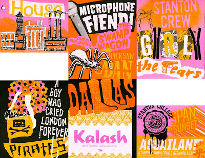
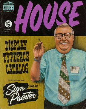
Inspiration and images courtesy of House Industries.
www.houseind.com
www.grainedit.com

Check this out for the RE-Packaging Project

Check out Flickr for ideas on how to create a bag, box or container for your wine redesign. (wine packaging) Here are some interesting designs and packaging that others have designed.


From www.napcousa.com


www.cpluv.com
www.designrelated.com/inspiration/kylewhitedesign